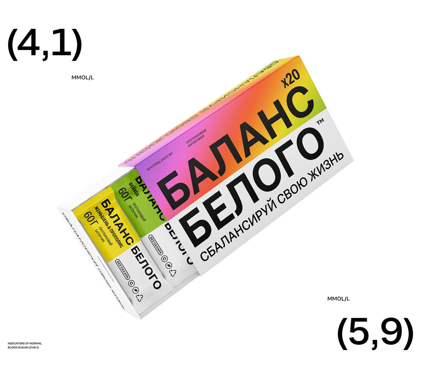
Diabetes products brand "White Balance" helps people maintain optimal blood sugar levels, comfort in everyday life and happiness in every moment. We not only know how to see beauty, but also consider it important to create it and surround ourselves with it.
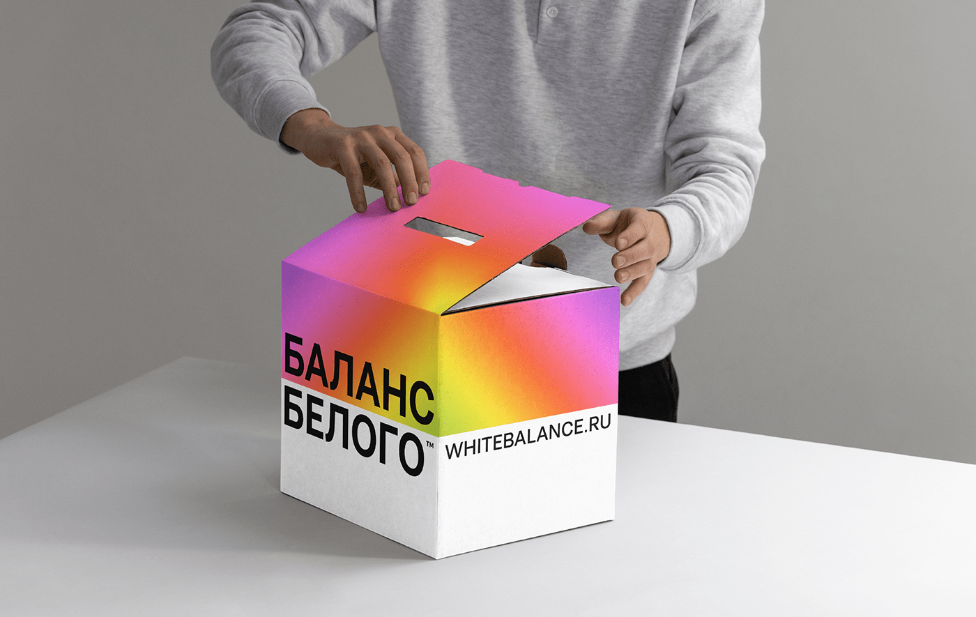
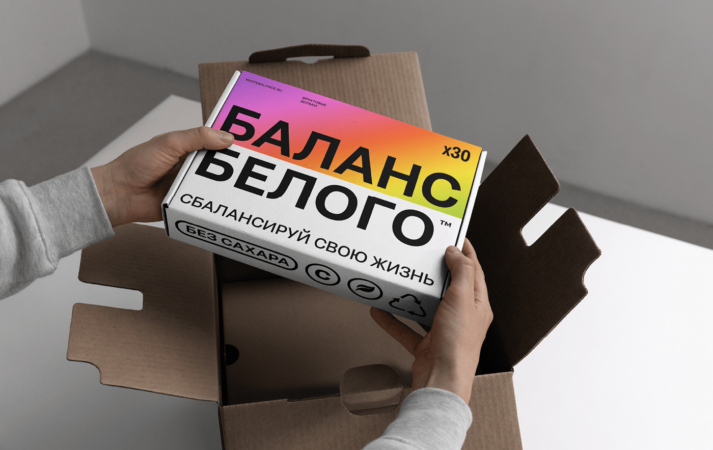
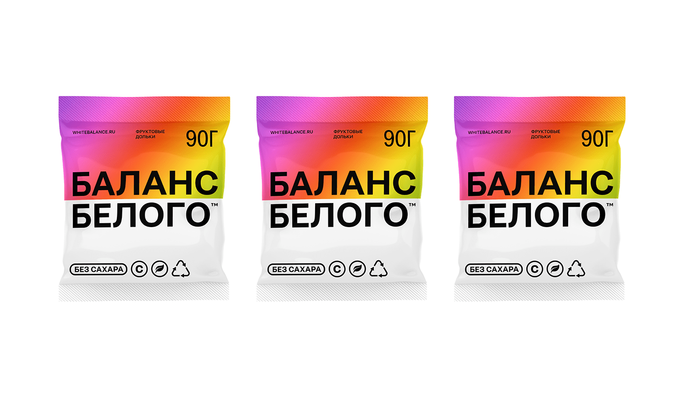
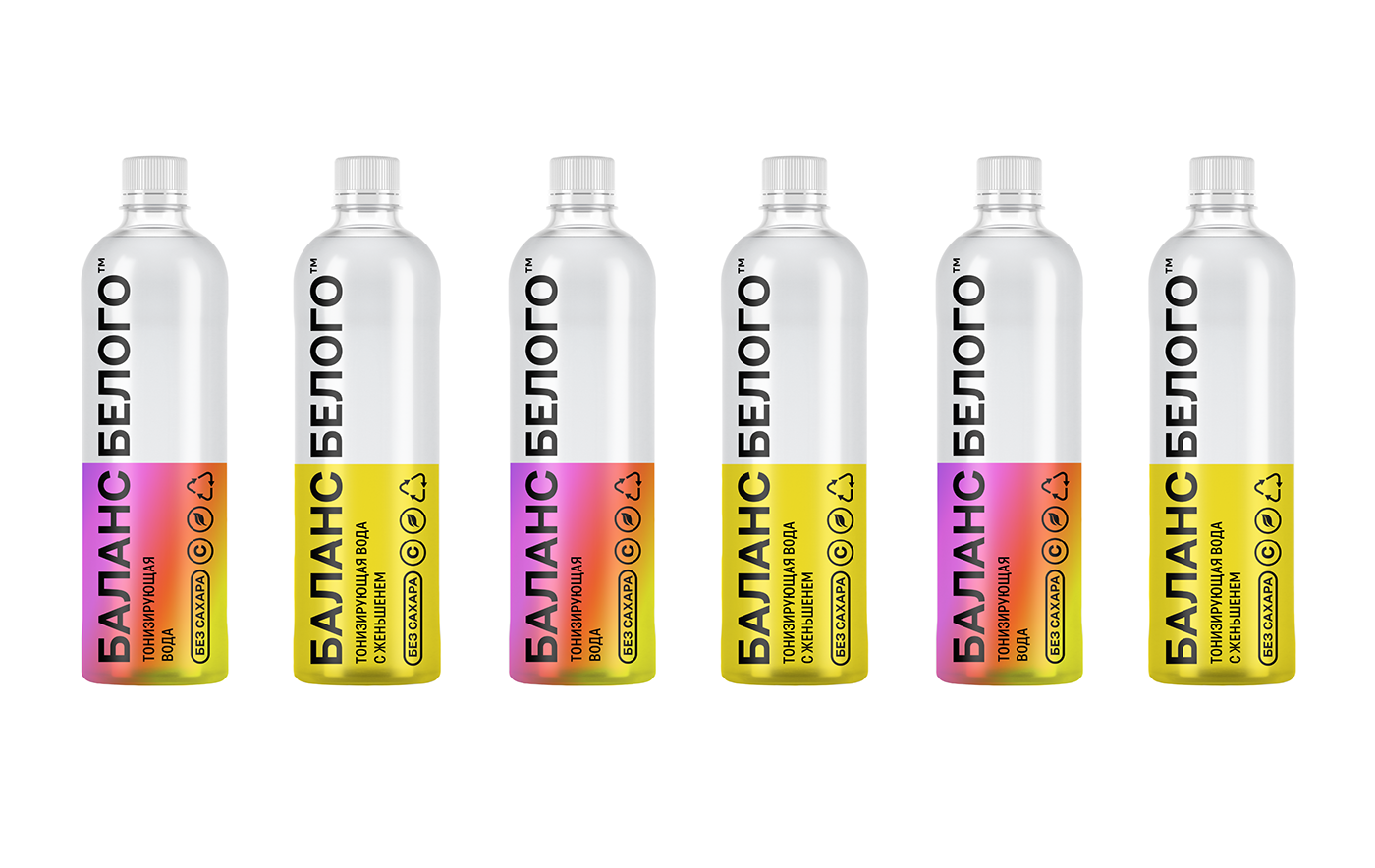
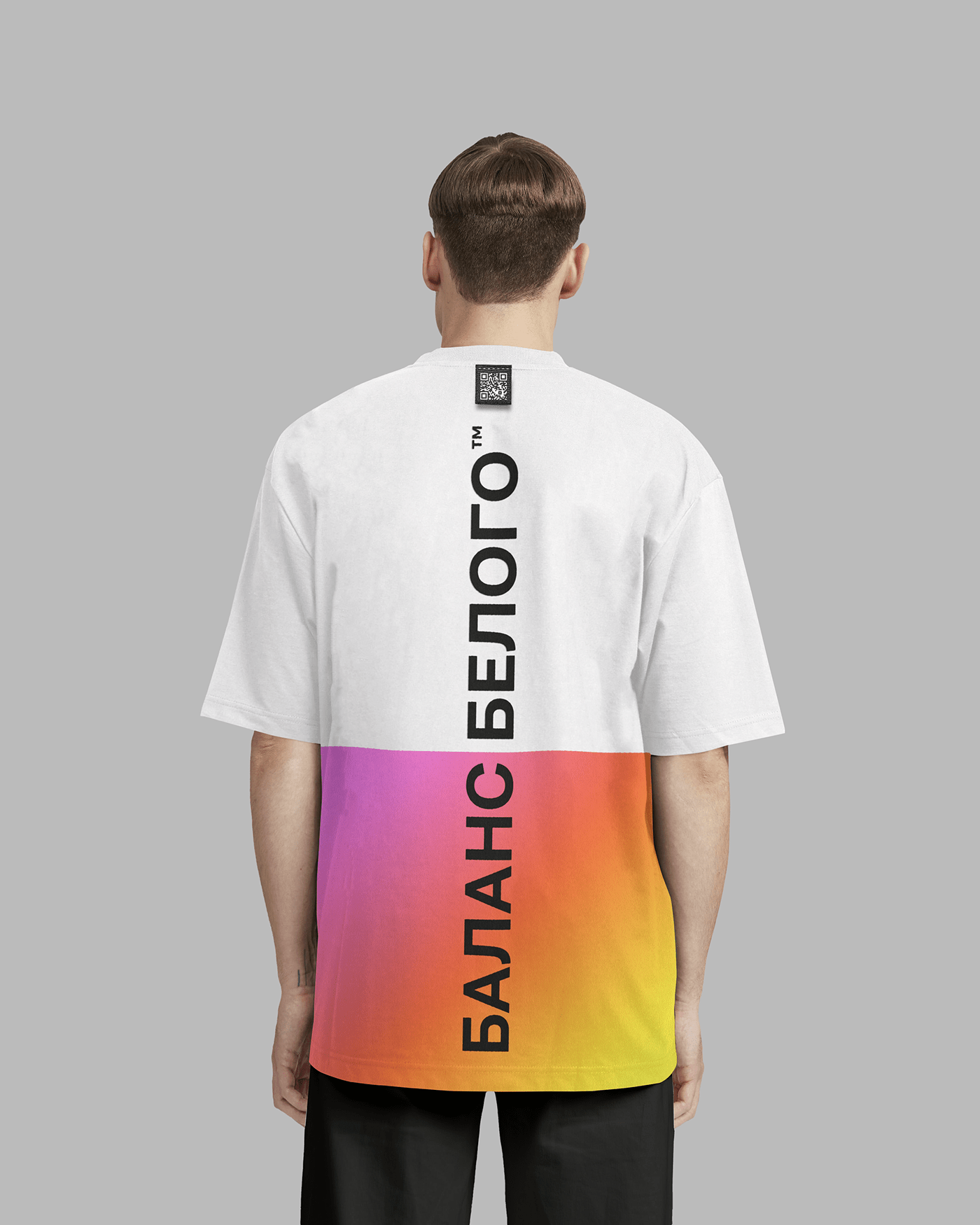
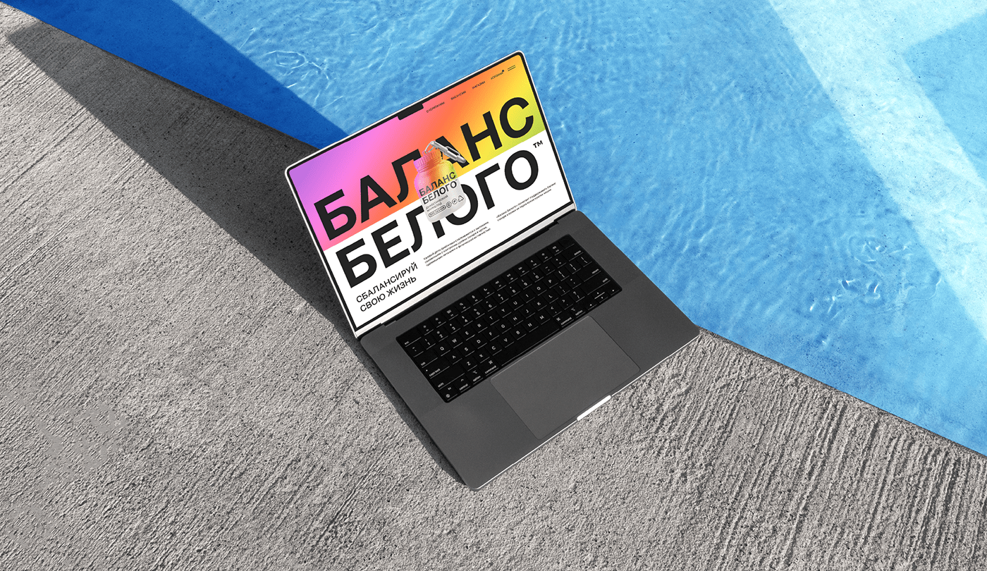
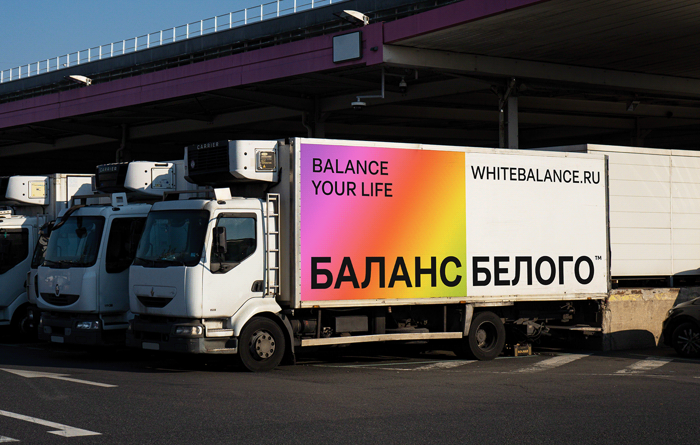
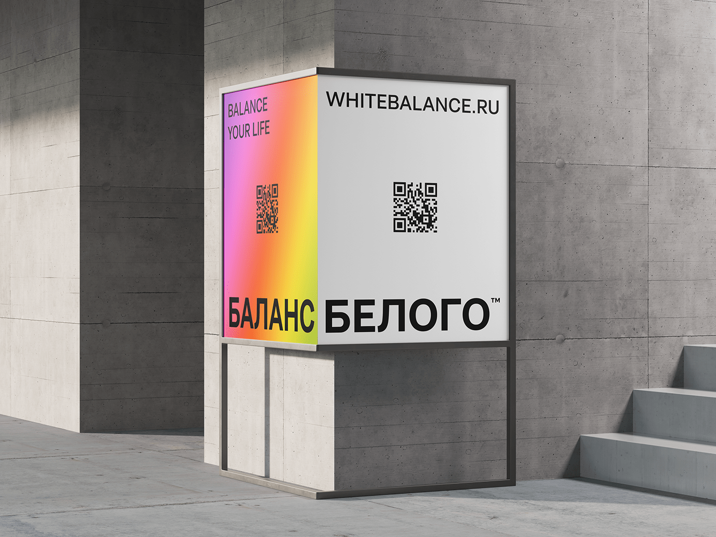
The packaging reflects the main metaphor of the brand: Keeping the sugar balance normal, you maintain the balance of your life. The packaging is visually divided into 2 parts. One indicates the balance of blood sugar, the second shows all the bright colors of life that can be experienced keeping sugar normal. Both parts are in balance with each other, once again emphasizing the importance of self-care.
The soft gradient is the vivid colors of life and balance. In brand communication, the gradient changes to live photo/video content that supports the metaphor.
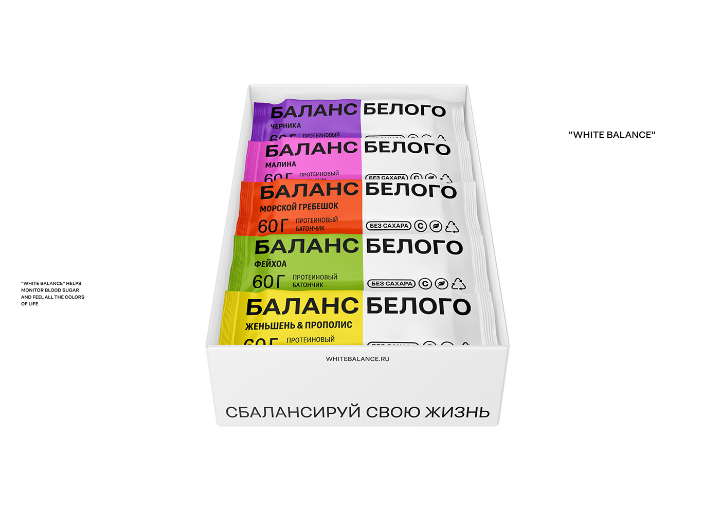
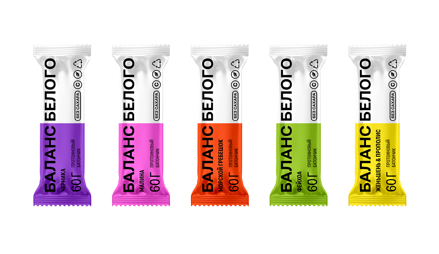
"White Balance" offers 5 main flavors of protein bars. Some combinations are not entirely familiar. They are designed to take into account people who do not like sweets, but also want to try something unusual and useful.